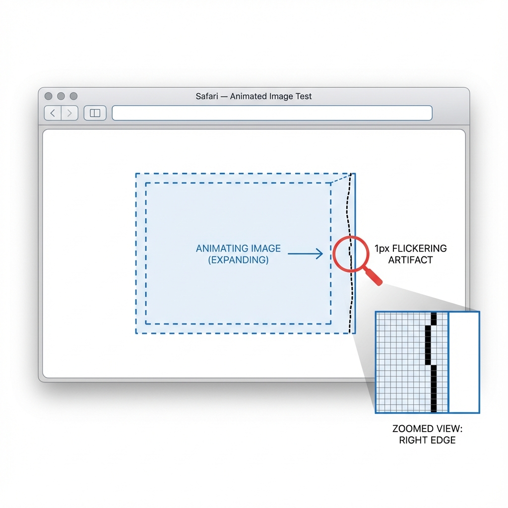
Safari Animation Artifacts: The 1px Black Line Glitch
Fix the jagged edges and flickering lines on expanding images with outline: 1px transparent
You've built a perfect grid of images. On hover, they scale up nicely with a CSS transition. It looks flawless in Chrome and Firefox. But in Safari, you see it: a distraction—a 1px flickering black line or jagged edge that appears on the border of the image during the animation.
This is one of Safari's most persistent rendering artifacts. It occurs because of how WebKit handles anti-aliasing during hardware-accelerated transforms, specifically when scaling raster images.
The Root Cause: Subpixel Rendering
When you apply transform: scale(), Safari promotes the element to a composite layer (especially if hardware acceleration kicks in). During the transition, the browser has to recalculate the pixels for every frame. The "black line" (sometimes white/transparent) is essentially a rounding error in the anti-aliasing calculations at the subpixel level, where the background color bleeds through the edge of the layer.
The Fixes
There is no single "correct" fix because the artifact behaves differently depending on your specific layout (grid vs. flex, hidden overflow, border-radius). However, these four solutions solve 99% of cases.
1. The Outline Trick (Most Reliable)
Adding a transparent outline forces Safari to calculate the element's bounding box differently, often effectively "clipping" the subpixel bleeding. This is often the most lightweight fix.
.image-card {
  /* Forces Safari to include the edge in its paint rect */
  outline: 1px solid transparent;
}
2. Hardware Acceleration Force
Sometimes the issue is switching between CPU and GPU rendering. Forcing the element to stay on the GPU can stabilize the edges.
.image-card {
  transform: translateZ(0);
  /* or */
  will-change: transform;
}
3. Backface Visibility
A classic fix for WebKit flickering. This helps when the artifact is related to 3D space calculations.
.image-card {
  -webkit-backface-visibility: hidden;
  backface-visibility: hidden;
}
4. Strange Magic: Small Rotation
If the above don't work, adding a microscopic rotation can trick the anti-aliasing engine into a different mode.
.image-card {
  /* Rotate by a tiny amount */
  transform: scale(1.1) rotate(0.01deg);
}
Production Recommendation
Start with outline: 1px solid transparent. It has zero side effects and fixes the majority of "bleeding edge" issues. If the flickering persists, combine it with will-change: transform to ensure the browser prepares the layer for animation.
/* The robust mix */
.card-image {
  outline: 1px solid transparent;
  will-change: transform;
  transform: translateZ(0); /* Optional: if still flickering */
}
Advertisement
Explore these curated resources to deepen your understanding
Official Documentation
Related Insights
Explore related edge cases and patterns
Advertisement